
To address Blog Banter 38, I decided to get an insight into the current design philosophy behind EVE. In order to better understand how the revitalised CCP would be moving forward and addressing design idiosyncrasies in the future, looking at incoming improvements seemed a good barometer of change. After all, there's only one chance to make a first impression, so the upcoming changes to "New Player Experience" will be crucial to the EVE playerbase of tomorrow. How that first experience is received will determine who sticks around and who clicks uninstall.
Singularity, the EVE Online test server open to players, allows early viewing of new content coming to the "real" EVE Online on the Tranquility server. Yesterday, I played through the new tutorial to get an idea of the first impressions New Eden's new arrivals might have. The experience left me excited, impressed but ultimately sad and disappointed.
For those of you without the inclination to read through what has evolved into quite a lengthy post, here's the TL:DR;
New Player Experience = Technically Improved but Increasingly Soulless
For a deeper analysis, read on.
Necessary Sacrifice
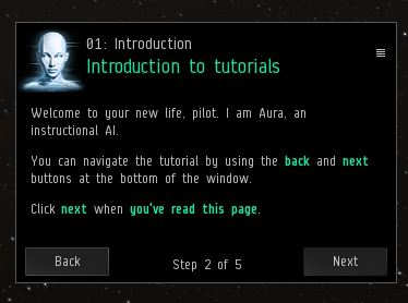
The next thing that is noticable is the new tutorial window. Defaulting to the lower-right corner of the screen, it occupies a similar portion of the screen to its predecessor, but appears clearer and cleaner. The most welcome change is the auto-resizing. There was nothing more frustrating with the original UI than having a default window size that required you to scroll down to read the last line of text. I look forward to seeing this technology applied to other UI elements, such as item info and the Unified Inventory.
The flow of the tutorial has more pace and doesn't get bogged down in as many details as before. Without much ado, the new player will find themselves floating in space in their capsule, where they are quickly encouraged to understand the camera controls. This is a great change, with the needlessly bloated previous experience of drowning in windows banished and the disorienting initial in-space experience better explained. Basic gameplay elements are introduced as necessary, with just enough introduction to the overview without having them running for the hills. Ship fitting is handled well too, with a simple step-by-step process being presented in a rewarding manner. Once the rookie ship has been obtained from it's location in space, the rookie is guided to dock up to fit a weapon and a shield module - the default civilian weapon and miner are gone! Sadly, the Aura voiceover has also been dumped, but it would no longer make sense with the new tutorial flow, I can only hope there are plans to record new audio.
Technical Triumph


The user interface improvements really are very promising for the future of the client experience as a whole. It could herald the dawn of a more attractive and user-friendly interface throughout the EVE client. Exciting future possibilities are flooding through my mind as I write this. Anyway, I digress. At present, it's just a useful and effective way of presenting information to rookies.
All things considered, the tutorial is a big positive step toward better new player retention and the introduction of elements which could bring so much more to the game as a whole.
The (Un)Importance of Words
But for me, there's a problem and it's potentially a big one. Game-breaking even. It's not anything directly to do with the tutorial, which I think is a triumph. It is to do with the culture it represents.
Before CCP Greyscale's recent devblog on the tutorials was released, I posted my review notes to the Test Server forums. I was surprised and honoured to get not one, but three developer responses. I'm grateful to CCP FoxFour, CCP Sisyphus and CCP Greyscale for their feedback in which they explained most of their decisions behind some points I raised. The way the tutorial was approached and the design philosophy behind it makes perfect sense and as players we are lucky to have a developer-player culture that allows for this level of communication. This is something that CCP developers are clearly making an effort on, in response to criticism. Again, this is something we are fortunate to have - game designers who respond to player communication and input in a positive way. Great explanations were given for all of my concerns.
All except one, and I am happy to admit it is one that is a matter of taste. But from my point of view, there is irony to be found in the fact that, as developer communication improves out-of-game, they seem to have lost the art in-game. For all their design-fu, their current designer-led use of language suggests a worrying trend.
Attack of the Designers

I understand that a lack of time and resources meant that - at least initially - an entirely written tutorial format was the only viable option and may be improved upon later. Fair enough. With that in mind, I suggested making the new text more engaging, using EVE's rich lore to provide a bit of colour and the option to explore the backstory further. I hoped that I would be told that the existing text was simply a placeholder until it could be refined. That is not the case. The anodyne and unengaging text was a design decision. The key word here is "design". Stepping out from the shadows over which he formerly had mastery, CCP FoxFour wrote:
"This was also a rather conscious descion on our part. The tutorial is rather long as it stands and one of our goals going through the NPE this time around was to cut it all down as much as possible. There is a good chance we may have cut to much and finding the right balance between lore and length is a hard thing to do. Even adding a single sentence to each page adds up to a whole lot of extra text. Again though we went in with the primary goal of cutting the text down as much as possible and so we did. Hopefully in future iterations we can look at ways to bring that lore back into it without exploding the amount of text in it."
This all seems perfectly logical. It also shows a vision of the future of EVE; "simple", "effective", bland. These are individuals who are excellent at designing, at being given a target or a problem and engineering a path to the solution. God knows after over a decade of growth, EVE Online needs people like this to prune the features and trim the code. But they need the other kind too to bring character, flavour and depth to the EVE experience.
Oh wait, no.
That's now entirely the players' job according to CCP Unifex. As was stated in his interview with Gamasutra, despite having a lot of game designers, programmers and engineers, there are only four content developers, because apparently EVE development is all about...
"...building tools so that players can make the content, and that content is firmly rooted in interactions with each other."
I can't help but find this a little irritating and insulting. Having an active and creative customer base does not absolve a game developer from providing good quality content. It certainly doesn't mean that they should just skip over the details entirely. Given that it seems to be down to the players, I would offer to revise the tutorial text for a (possibly optional) canonical version, but I suspect it's an offer that would be ignored - besides, they've apparently got at least four people that should already have been approached to do that.
Teaching Doesn't Have to be Boring

Here are two examples:
IMPROVED TEXT EXAMPLE 1
The new tutorial text says:
"If you ever enter a station with no ships available, you'll be given a free Rookie Ship, so you're never stuck without proper transport."
No attempt is made to explain why a new ship should miraculously appear and the sentence isn't even that clear - the "no ships available" could mean on the market, not in the player's hangar as is intended. Furthermore, this is a perfect opportunity for a bit of colour to draw the new player into New Eden. In the forum thread, I suggested the following;
"If you dock at a station in your capsule and there are no ships in your hangar, a new Rookie Ship will be provided by the SCC."
This provides all the required information and does it more clearly and more succinctly. It also provides a link to more information that can be ignored or explored according to the new player's curiosity.
IMPROVED TEXT EXAMPLE 2
The new rubberbanding tooltip draws the new player's attention to the first hostile ship they've ever encountered with the text "This is an enemy ship (not as good as yours)". What? This trite and bland information, whilst doing the job, is incredibly uninspired and has no place in a professional MMO. I understand that what the designers want the player to realise is:
- This ship is hostile.
- Although it's shooting at you, don't panic - it's no real threat and you can take him.
What has either not been considered, or has been dismissed, is what players might wonder - why is it attacking? What makes it "not as good"? In the Minmatar tutorial, the attacking ship model was a Rifter, so our new player may now associate Rifters as being "not as good" as rookie ships. The text could easily be replaced with something like "Poorly maintained pirate frigate" - not only is this shorter than the existing phrase, addressing FoxFour's concerns about text length (33 characters instead of 44), it explains why the ship is hostile ("pirate") and why it might be easy to kill (it's "poorly maintained" - but maybe if it wasn't, you'd be in trouble).
However, CCP Greyscale explained why this was not something they would embrace:
"For now we're erring on the side of trying to focus very hard on teaching, and trying to throw in as few unnecessary concepts as possible. As a fiction-head I'd love to be doing more of what you're describing, but as a designer I'm not confident enough in our revised NPE yet to start throwing in references to the backstory and links to the wiki when our overriding goal is to get people through the tutorial as effectively as possible."
The Abandonment of Soul

This smacks of CCP suffering post-traumatic stress disorder as a result of the failure of Incarna - it's almost as if they're avoiding all immersive content at any cost. If the tutorial acts as a filter to ensure the retention of the right kind of players and the repulsion of the unwanted, it seems quite clear that CCP doesn't want those with an appreciation for narrative detail, immersion, an engaging science-fiction environment or a grand space opera. What they are now looking for are players who can endure mediocre content until they find the right social hook.
This single-minded approach to focusing on the "social engine" leads me to interpret CCP Unifex's words to mean that we players are expected to embrace the community-driven stories or clear off. If we're really patient we might see the rare scrap of professionally-written narrative, but it's not a priority. The future of the EVE story isn't going to be in the form of quality science-fiction akin to the works of sci-fi greats like Isaac Asimov and Arthur C. Clarke, it will be EVE News 24. Sorry Mr. Lander, but if that's the case, count me out. I like a bleak and dystopian future as much as the next sci-fi geek, but I couldn't cope with endless clumsily-written jargon-heavy accounts of what the big boys in the space playground did to the slightly smaller boys in the space playground. Plug me back into the Matrix, please.
It seems that - when CCP accepted they botched the Walking in Stations concept and had their change of direction - they threw the storyline baby out with the Incarna bathwater. Now the crib is empty and the house is silent, so CCP has to keep inviting players to throw parties to fill the void.
The baby is still dead in the gutter though.
Sad times ahead. I think I'll go play Incarna: The Text Adventure to cheer myself up.
